Thursday, 5 May 2011

Final Double Page Spread


Final Contents Page

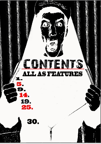
This is my final contents page.


Once i found the right image to use as it, the rest was pretty straight forward. I looked at magazines not just punk/rock genre, but all contents in magazines and one thing stood out to me: simplicity. They were detailed, but just enough detail to guide you through the magazine.


I also followed the same house style as the front cover, which makes the whole magazine coherent and easy to read. The red, black and white really suit along with the hard hitting central image which gives off the felling of rock/punk due to its as if he is shouting the contents at you.

I really liked this design, and goes well with my magazine front cover.

Contents Preperation


Final Front Cover

This is my final magazine front cover.

You can see the first attempt of creating a magazine front cover is quite simialir to this one, this is because I followed the same house style of it. I did this becasue i though the red, black and white complimented each other and stood out.

I changed the backgrund to white because it made the centeral images more visiable and the centre of attention.

I also moved the title at the top so you can easily see what the name od this magazine is. Along with adding some features which tell you what you can find inside the magazine.

1st Attempt of a Front Cover


This was my first attempt of a front cover from my second photoshoot.


I experimented a lot with a numerous of things such as: brightness, black/white or colour, placement and layout and style.


As this was my first try, I thought that it was pretty good, but it was lacking some things such as: the title at the top of the page and features where the title is telling you things abotu the magazine.


Although, this set me off to produce my final front cover.

Reasons For 2nd Photoshoot

I wanted to take another photoshoot because the original pictures that I had taken in the first shoot were photos that were not really suitable for the genre I had changed to. At the time they were fine, but as I progressed and looked at many different magazines, I thought that they were just not usable. Along with the quality of the shots, they were not up to a high standard that can be used on a magazine.

2nd Photoshoot


Wednesday, 4 May 2011

Final Magazine Influence


These are some pre-existing magazines that I have looked at and what my magazine to follow the same layout and feature. At first I was going to do Indie/R&B, but then i decided i was going to change to more of a Rock/Punk based genre. I changed to this because the 2nd photoshoot I have taken has more of a Rock-ish feal around it, and I thought it would be more realistic if I changed.


I also think that there is only two main leading magazines of Rock/Punk and that is Kerrange and NME. So I thought it would be a good idea to challenge them and see what I could/can produce. Along with that, it means I have more of an influence and something that I can inspire to produce. I also had a go at a lot of different fonts as you can see on the left, too see which style could fit my magazine.

Edited Images from 1st Photoshoot


These are two images that I had edited from the ist photoshoot I had taken.


I didnt really like these as you can see they are no where near finished, but it was still good experience fro me to see what it would look like. And helps towards me producing my final piece.

First Photoshoot


This was my first photoshoot that I had taken myself. It evolved two people, a dark room so I could evolve a light to help with the shadow, and really improve the quality of the photos. At this point my genre of magazine was indie/R&B so that is way I also had guitars in my shoot.


I took well over 150 photos in this shoot, so I had many to choose from, although, at first I thought the images were fine. However, as I started to edit them, I realised that they were not very focused. Some were better than others but just not good enough for my final image.


From experiencing these images, and now knowing how to take a photoshoot, I used these as a first trial run and decided to take another photoshoot soon.

Flat Plans

Before I started anything to do with my final magazine, i looked into how a magazine is laid out and how it is formatted.

I created my own flatplan. One involving one centeral image, and one that involved a pair of images. I made one of each so i could see what it would look like laid out.

I also added all the extras that go along with a magazine such as a puff, lead article, features and many other things. This helped me understand how a front cover is structured.

Charity Photos


These are the pictures that I personally took to use in me charity magazine. I tried to use a wide range of shots to see what the outcome would be from many different angles.

The varity of the shots really shows different meanings. For example, the low shot suggesttes that the alcohol is overpowering the car keys to symbolise the priorities of which is more important.

Where as the high/birds eye angle could also suggest power and status, but as the soft drink is also in the frame, you personally have the decision to choose which you take. The power is in your hands, not the alcohol overpowering you.

Along with the keys being isolated, you could feel that you are along in the choice and that any other circumstance is yours and yours alone.

Charity Advert Research


I also had to create an charity advert. This also took a lot of planning and researching to decide what i want to base my charity on. So, I researched a lot of existing charity posters, billboards and adverts to see what one already looks like. I looked at areas such as drinking, smoking and animal cruelty.

It was hard to decide which one i wanted to do, so I went into a lot of depth to get a clear understanding of what I was going to choose. In the end, the one the jumped at to me was alcohol. At the point of me choosing it, there was already many
adverts on television and billboards so my influence was easy to choose.

Even though many of the other examples were very hard hitting to me and could of been very fun and creative to play around with. I thought it would be best to do a subject that is current.


Preliminary Task

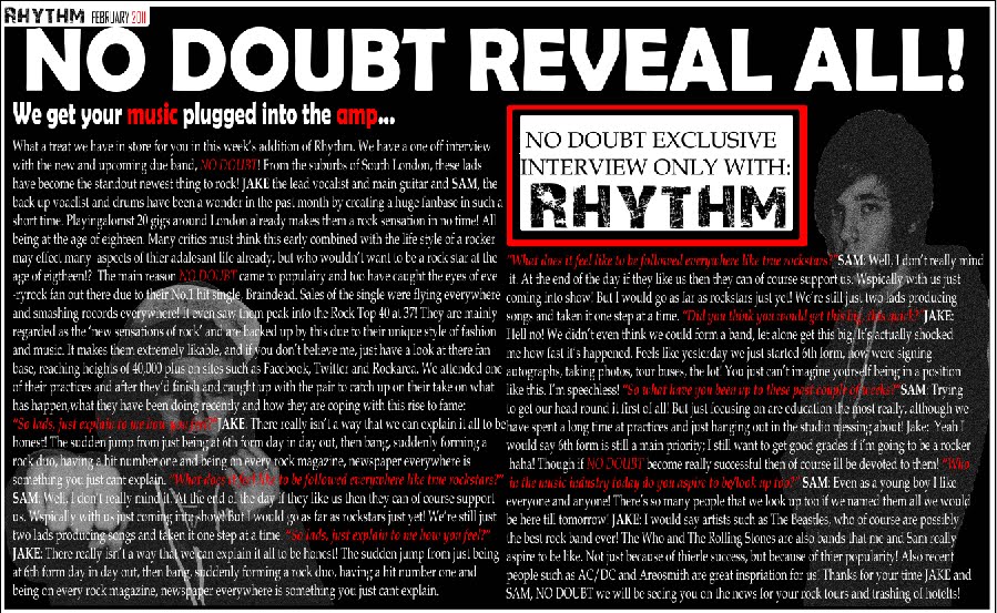
This was my first effort of producing a magazine that I started at the start of the year. As it was the first time of using photoshop, I was learning the ropes and the basics of how to use it.

As you can see, I have edited both of the images, played around with the mastheads of the pages and tried to incorporate some instrumental details in a real magazine. things this are such things: barcode, price, skylines and follow the same consistent colour scheme throughout. As well as the layout and structure of a magazine, I looked at many pre-existing magazines which caught my eye as you can see below. This influenced me into my choice of genre.