Monday, 28 November 2011

Elements of a Photoshoot

Depending on the size of your band, there should be at least a minimum of 3 and a max of 5 people in the band. This is a good amount due to making them all fit in the photo, being able to represent a band and also allows you too have many more photos (a different variety) too if there were only 2 in the band. First of all you most always remember the look of the band. Without a doubt this is one of the most important too any photo shoot or even any band. The genre that the band sings must be represented in the way they dress. For example, if The Clash dressed in the modern day pair of chinos, low cut t-shirt, vibrant colour jacket and a pair of vans, this would in no way match and just look absolutely ridiculous. Therefore when choosing the image of what they are going too look like or what there dress code is too be, you must always remember what music they sing. So, due to the band I am photographing, and they are rock/punk, I will either make them dress as something really stupid (the idea that they go against what people think of them) such as: clowns, formal/smart dress such as shirt tie or the classical 'skinhead' look. I think that all these outfits will capture what the bands image is trying too represent and put across.

Wednesday, 23 November 2011

Existing Magazines Related To My Genre

I've started too also look at what magazines are existing in the music industry/market. Especially, I have tried to focus on the types of magazines that relate to my genre of rock/punk. I easily found many very well presented influences such as NME which is a popular music publication in the UK, published weekly since March 1952. It started as a music newspaper and gradually moved toward a magazine format during the 1980's. This is a great magazine for me too look at because it is the pinnacle magazine of rock/punk music. Many great bands of the past and present have been published on the front of this magazine. The reason I have looked at these magazine front covers is because I can see what the main style of the central image is, what the layout and composition of the magazine is like so I get a good understanding of when I make a magazine advert which will be published into a magazine like this. By looking at these I get a better understanding of what I must create.

Also this front cover of the same magazine, NME is a lot different to the one above. I have chose two different ones so I can get a lot more information and influence if I look at a variety of examples. The contrast between then both is always related to the central image and who the magazine is writing about. The main element is the person, band, singer etc who is found on the front. From this, all the other elements of the magazine are put in to place to relate to the main focus. For example, the other text boxes around the side might relate to the person on the front cover, or the style of the magazine is related to the genre of which the band/singer sings. All these little things make up what the magazine is about and each element reflects its own, small part in what the magazine is trying to get across. All of this will help me, and make me consider how I will compose my magazine advert, how to set it out, market it, style it and any other way I will make it appeal to my audience and reflect the band that it will be about.

Whereas compared to the other two magazines, this one is much different style compared to NME. Classic Rock is a magazine which is a special edition printed text which focuses on bands or artists which are well known at the time and in the lime-light. This magazine is very different too other magazines by the way it presents the main focus which is on it, in this case it is Pink Floyd. You can see this by obviously the title of the band and the main elements which are iconic to the band, the hammers, beams of light and the glass pyramid. This is really good to look at because it relates to both a magazine cover and a magazine advert by only focusing on one artist and what they are about. Also the well laid out, attractive and colourful layout of the cover relates to the band and also the style stays on track with what genre the band is. This is a great example and a good influence in how too great a magazine advert.

Tuesday, 22 November 2011

Music Questionnaire


As you can see I completed a questionnaire with my group that am working with going round asking people music based questions and gaining a better insight into what it is like in the music industry today. By doing this questionnaire, it gives us clear evidence of research into our target audience. The results we did find who quite useful, however, it is a very small market of people we interviewed due to doing in it a confined society. It I was going to do another questionnaire I would make sure that we had much more of a target audience and much more of a balance of questions. Although we as a group can not stray away from the fact that research is research and ever little bit is vital to finding out about the music industry and what is out there already

Thursday, 17 November 2011

Punk/Rock Magazine Adverts

As I'm doing the genre Punk/Rock, I thought it would be best if I started too look at what is already out there for a magazine advert. However, this type of genre has quite a small market and not really many magazines publish about it, therefore it is quite hard too research for influences. Although, I was able to find a great idea for the genre I'm doing in AC/DC. This magazine advert epitomises what Punk/Rock bands are about. The typical dark, black and dingy background really captures what the genre is about, also it could mean that at the bottom it is all dark referring to hell. Whereas when you start too look towards the top, it is much more lighter due to the bands name being shown on fire. This reveals that they might be an aggressive band in their music style. Though the main part is the slogan found in the bottom-middle of the advert saying 'BACK IN BLACK.' The meaning of this could be to do with going back to what they were like previously or turning into a new 'black' era for their music.

This magazine advert is much different too the one before due to it having a lot more on it. First off all you can see the main elements such as the bands name, and the title of their album. This shares the same qualities as the AC/DC magazine advert. However, this has a lot more conventional factors on. Things such as when it is available to buy, what elements it is sold on e.g digital, CD etc and quotes and reviews of the album. Also, it has website quite small near the bottom and in the far left corner it has the record company this band is signed to. Looking at this magazine advert, it is much like something I would want to do, due to it being out there, informative and attractive. I would want too allow my consumers and audience to know what they are buying, where to buy it, what well known critics think of it. An something I always emphasis is the consistency of this style. All over the advert it has a style and layout that is simple and indubitably similar.


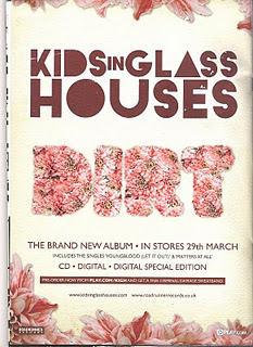
This magazine advert is much more to due with the genre that I am going to do. it does have it's differences but it is more on the lines of what I am doing. Along with all the other ones, it still follows the obvious trend of having the bands name bang in the middle, so it is simple to know who's it is. This also has the release date of the album, bold at the bottom so you can't miss it. It also has some other small written which might have reviews, quotes, websites or just information about the band or album. Along with the one just above, it has the record company placed on the advert, but the main thing about this advert is the design and layout. How it is made really reflects the type of band Slipknot is. As you can see, the band name looks as if it has been written in blood and has a horror feel around it. Along with the pictures around the title all look quite disturbing. This really captures the bands image and what genre they sing. If I follow all of these ideas and incorporate them into my own magazine, I should have a well influenced finish piece.

Wednesday, 16 November 2011

Layout of Digipak's

If you have a look at all these digipaks they all have a consistent style and certain make. The one too the left is still a digipak just I could not acquire the picture of the whole digipak. The following style of the digipak is not just open a case and it has two sections, but has numerous areas of the CD. Jack Johnson's album opens up to have three compartments. One for the CD another for a booklet about the album and one for an little advertisement section. This is quite a good completion of things due to them providing the consumer just more than music, but a helpful guide to the album.

This album is a great already existing album too present a digipak. The three different sections follows on from the album above. This is mainly the original style of what one looks like. The area for the CD, one for information booklet about the and then an advertisement of the album. Due too seeing this album, I am influenced and will probably follow the same characteristics of this one too incorporate into my own style and final piece. Also the main factor of all of these, the same as the magazine advertisements as well, is the consistent layout, style and genre all the way through.

Whereas compared to the other digipaks above, this one is much more complex and different. As you can see it has four CD slots and is much more of a rare design. It has taken the form of the layout of a box like CD case when you fold it all up. This could be very interesting and valuable to the sales of the album due to it being unique and not really seen before by the audience and consumers. I would like too make something like this due to it not being usual and normal to the music industry but for attractiveness towards the market, I would probably think it's better too keep my design simple and easy yet still eye-catching.

Tuesday, 15 November 2011

Existing Magazine Advertisements

As you can see, it has mostly all the main elements of making a magazine advertisement for a band or artist. It has the singers name (Ellie Goulding) and the album's name 'Lights.' It is then followed by many review quotes about what critics think about the album, and also rating the album out of five stars which is common among the music industry. One of the main factors of this advert is of course the image. The image is of the artist herself which makes a bold and clear statement who's album this is. By doing this, it simple makes it easier for the consumer to see who's album it is. Slightly over shadowed by what looks to be the idea of controls on a MP3 or Ipod, is the image of the albums and the artists record company. This is a vital point because it shows who has given the artist a chance in the music industry and it is only fair to have their name/logo on most texts from the artist in return. However, it doesn't have any of the other elements such as: release date, band/artist website or available to buy, this might indicate that the artist is well known and doesn't need to offer this information to it's fans.

Whereas in contrast, this magazine advertisement of 'The Temper Trap' who are less known than Ellie Goulding have much less information on there advert, but could be argued that they have more of a niche market of loyal followers which suggests they don't need too post all their information on their text's. Their advert is a simple idea, a main central image on a solid black background which makes the image stand alone and the main focal point of the advert. Then, a neon like band/artist title and the name of the album which suits well with the contrast of black and white. The only other element it shares is the record company in the bottom left, other than that it has no other things which mainly makes a magazine advert. This could suggest that they are less worried how they are presented to the public and how they sell their products, or it could be simply they know who will see it or who will find it, and therefore rely on their consumer market too do the work in finding the bands new material.

All of these advertisements are very unique to each other. They all have similar characteristics, however have their own style and genre. The variety in this shows the differences in how a band or artist will present themselves to the audience/consumers. This magazine advert of the band Noah and the Whale 'The First Days of Spring' is a much more gentle, free and easy going advert. Whereas the other two adverts have the central image bang in the middle of it, this advert shows the image at the bottom and is not really the focal point. The easy following title and simple text gives the feel of reading the information first and leading you on towards the picture. The background add a drifting feel to the advert, especially the look of a summer day in the breeze. All of these elements makes the advert seem very engaging and attractive, so it will have no problem catching the eye off the audience. With all of these adverts, the most and main priority is that they all reflect the genre of the artist or band. This is a main factor that I will always try and focus on when I come too make my own advert.

Monday, 14 November 2011

Digipak research (Magazine)

The key features of a magazine advertisement listed below are extremely important in order to promote the CD or DVD (in my case it would just be a CD.) Magainze adverts are usually easily recognisable to the particular band/artist due to it obviously being a printed text off them. These key features that you see are as follows:


Band/artist name or logo


Album/Digipak name


Image (cover art from the album/digipak, original image of the artist or band or an completely unrelated image (un-common)


Release date


Band/artist web address

Available to buy (e.g HMV/Virgin)


Record company


Review quotes


A main factor of the magazine advertisement is of course, how do you sell it, What language and imagery is use and how do the record companies persuade fans to buy the product? Well, the advertisement will usually have a "featuring" or "includes" the band/artists biggest hits or number 1 singles. Incorporating these big hits on the advert engages the audience attention towards wanting this album/digipak.


Magazine adverts are very bold and to the point, they don't contain any pointless comments or information so the language used is informative, basic and mainly useful for whoever if reading about the band. Also the imagery used is normally the album/digipak itself, this is for the simple reason the consumer will know what they are looking for when they go to buy the product.

Thursday, 10 November 2011

Editing A Music Video

Not only is filming a main component to making a music video, but the editing of the video is possibly the main part. Without the edit you will just have one long strand of video which is no coherent and in a chronological order. What you want too do is review all the takes and choose your favourite take for every shot. Maybe in practice, you may prefer different sections from different takes, for example, you may decide that your favourite beginning of a crane move is in take 2, whereas your favourite ending of the crane move is from take 6. Which would be fine providing of course that there is a cutaway between the two slips. If I wished the crane move to be uninterrupted, which is quite unlikely in a music video, you will have to choose your favourite take and leave it uncut. This is good information for me to know if I did wish to change my video about.


A main trick that is always good to know and helps edit a music video efficiently is to place all the selected clips on the timeline, one above the other on stacked video tracks. They must all be in their correct positions relative to the song, e.g they must all be synced - expect the cutaways which can be placed wherever you want them too be.

Shooting a Music Video

A music video, much like a drama, should be firstly well planned out before filming, or even well scripted before you think about shooting. You must also gather a lot of useful and creative film of the band that you are making a music promo video before. With this you will then have a much better and progressed chance of creating something well made and edited. Along with the basics of filming, with new film companies, especially me and my group, we will be shooting the video with no investment from anyone, which is in no way a problem due to many good influences have come from really low budget videos. For example, Rizzle Kicks 'Down With the Trumpets' video was a low cost production cost, due to it being very simplistic and not must technology or producing extras were needed.

Also, for music video shoots, it's always a good step to record the track that you are playing back on set as you shoot. This 'scratch track' as it's known as, will help you synchronize the shots with the clean track post-position. Along with instructing the singer/band to sing properly, and not just too mine the words or even sing it half-hearted. If they mumble the words or mine, it won't look right when you lay the shots against the song, because the tension and movements of the face and body will not be consistent with the sound and track of the song, making it look disjointed and not professional. This is something that I will be very concerned about and will want too make sure it done well.


Not only is just about the singing, a variety of shots, angels and how you capture the singer/band is a main factor of how the audience will see and relate to the video. I will make sure that most angles cover the entire song. If I don't shoot enough angles of the whole song, the final edit I do of the video might be too slow. Also I've been looking at many influences and they use plenty of cutaways, which are also known as 'B-roll' shots. I would use these just like different angles to give some variety to the video. Many of the videos I've seen have inter cut a performance or dance routine shot with random cuts to shots in which the singer is neither singing nor dancing, but doing something vaguely relevant to the music video's genre and theme. As mine is punk/rock, I will make them do something stereotypical such as: being antisocial in an appropriate manner, or going a bit off the rails and not abiding by the rules or laws that are set. One of these videos is Blink-182's 'In Too Deep' which shows them over-running a swimming pool and playing their song with all the equipment in it, along with many other things such as jumping off the diving board.

Tuesday, 8 November 2011

CD Sales and Statistics

Over the past couple of years, Cd sales have massively dropped while digital downloads has increased. The number of Internet user paying for digital music increased by just over 8 million in 2008 to 36 million Internet users, and purchases of online digital music downloads increased by 29 percent since last year, accounting for 33 percent of all music tracks purchased in the U.S.

All of this comes at the expense of almost 17 million fewer CD buyers in 2008 compared to the prior year. The decline in CD buyers cuts across all demographic groups, but was partically focused on teens and consumers age 50 and older. The best selling album of 2010 was Eminems's Recovery. Recovery topped the Billboard album chart for seven weeks last summer. However it was able to sell it's self out of stores despite making its nest in a sales climate devestated by free downloaning, a bad econmoy and a consumer base indifferent to the struggles of the industy. But at 3,415,000 copies sold on CD or digital download, Recovery sold more in a single year than any other album since 2007.

Katy Perry's inescapable "California Gurls" featuring Snoop Dogg was the most downloaded song of the year. A few other shocking statistics about the music industry market is: The total number of albums sold in 2010, 326.2 million, was the lowest since SoundScan began compiling the data in 1993. Total album sales dropped off nearly 13% when measured against sales in 2009. It's the same rate of decrease sales saw last year over 2008. Digital track sales grew just by 1% and nearly ever genre faltered; Classical, jazz and Latin all saw 25% declines in sales, however the only holdout was rap which saw sales grow by 3%.

This reveals that throughout time, the music industry has really took a beating by being able to download music digitally and not just going into a store and downloading it anymore. However, digital sales hasn't really seen a fast improvment, even with the sales of CD's declining. This could show that all aspects of the music industry has took and hit due to time and change of the ecomny.

Digipaks

Digipak is a patented style of CD, DVD or BD packaging which is a registered trademark of AGI world limited. Digipaks typically consist of a gatefold (book-style) paperborad or card stock outer binding, with one or more plastic trays which are capable of holding a CD or DVD attached to the inside.

Although digipak-style packaging is often used for CD singles or special editions of CD albums and the tall DVD Digipak. Such packaging is less resistance to it's ancestor 'jewel cases' which are used by major record companies, therefore it tends to show more signs of wear relavitely quickly. Although less vunerable to cracking than a jewel case, this disc case inside the case (mainly the "teeth" of the hub which secures the disc in place) remains rather brittle and prone to cracking if the packaging is crushed. Digipak-style cases grew in popularity among record labels and recording artisits in the early 2000's.

However, recently manafactures of these items have sought to reduce enviromental impact and improve functionality by introducing recylced components into its tray. One company has announced a 100% post-consumer PET tray made from recylced bottles which also eliminates the need for the "teeth." Historically, digipaks were mainly avaliable in large quanties but recent change has seen them introuce a new product called "digipak i-create" for the consumer market. I-create is a web supported concept that is aimed at music, photo anc creative markets.

All this information is useful to know in how I am actully going to make the album. It helps me with what style I want to go for and more importantly, what is popular in the recent market which I can then adpat to my style and have a real advantage of marketing my profuct and not just relying on my layout, colour, style and elemnts such as that.

Thursday, 3 November 2011

About CD Covers

The cover of an album became an important part of the culture of music at the time. Under the influences of Bob Cato who at various stages throughout his career was vice president of creative services such as Columbia Records and United Artists, album covers became renowned for being a marketing tool an expression of artistic intent. Not even the popularity of the bands rose due to them making a album cover but the importance of a cover design was such that some artists specialised or gained much fame from their work.

The talents of many photographers and illustrators from both inside and outside of the music industry have been used to produce a huge collaboration of memorable CD covers. Most of these memorable CD covers I have look at have a very distinct view of being very odd and quite controversial, especially in the past where laws and ideas were a bit more lenient.

To the left you will see the album cover 'Killing Puritans' by Armand Van Helden (2000). As you can well see, there is no band name, no band member, or anything to do with the band. Instead, there is a child holding a firearm in a open desert. This shows that the album cover can be as simplistic as you want it too be, but the meaning behind it must be extremely strong which is shown in this one.

Another album cover which is different than the one above but still shows the controversial side of album covers is 'Yesterday... and Today' by The Beatles. They have a lot in contrast to the other album due to having the band name, album title and band members. However, they seem to be dressed at professors or some kind of scientific persona, although they have what looks to be baby dolls with no heads and random limbs spread around the shot. We are unsure what this suggests but relating to the other album cover, it is just as provocative as one another.

An album cover for a band or artists CD is one of the main things to have when either promoting the singer(s), selling their product or anything to do with the appearance or style of them. The album cover must reflect the bands image and link to something that the bands identity shows. This could either be represented by the genre the band gives off, their values and beliefs (what they believe in, or what they like) or just simply an identity of the bands name can represent them. Although on some CD covers, people that helped produce the album cover have sometimes been featured on the cover, even if it has only been a name on the back or something small, the ones who helped with it will. This was recognized by the album (Led Zeppelin IV) who included Jimmy Page on the album which you can see on the left.

Already, there are many album covers, not just rock/punk but any genre that really stand out from the rest. You can take any artist or band and see that they have very interesting album covers whether it'll be pop/R&B.

Tuesday, 18 October 2011

CD Covers

All these Cd covers are the genre of rock/punk. These are the typical codes and conventions I want too follow when I create my Cd cover for my digipak. As you can see from all the album covers, the bands are obviously all well known dude to only having a small heading for the band name and all of them not having a clear and distinctive picture of the band members. This shows that the audience of these bands have a devoted following and will know what CD is theirs. Also the layout, colour and actually making of the covers, it seems to be they are very vibrant even though the typical sterotype for a punk/rock would be colours such as red for being British, black and kind of dark colours for that hard hitting music, but we see that they have very strong colours which is very out there. Also the very simple making of the cover related to the laid back attitude of a typical rock/punk band who don't usually abide by society's rules.

Tuesday, 4 October 2011

Filming

Me and my group have gone round outside with a camera and practiced filming. We all took it in turns too have a go at filming one another. What we started with is the basics such as: filming short bits; pausing, then filming another bit but the person has just skipped e.g walking through a door.

Other things that we done was tracking another person, filming close up, medium shots and far away. Different height of angels: low, over the shoulder and other shots such as that. Just so we could all get the idea of the concept of the basics.

After we got all got the hang of how to due basic filming. We then took the camera to a computer and uploaded what we filmed. We opened Premier Pro and edited many parts of the stuff we had with all different things such as: moving it about (swapping the end of the film to the front), snipping (quick changes.) adding effects such as fading, sound and slow motion.

Tuesday, 20 September 2011

Influences

Iv'e been looking at videos that relate to my genre of punk rock. I have been looking at bands that have a unique and consistent style and genre. I have looked at the Clash, UK Subs, the Specails and many other bands that really idolise the idea I am going for. Also a bonus of looking at bands like this is that the group of people I am filming for my promo music video, really like and listen to the bands videos I have looked at.

Thursday, 15 September 2011

Type of Genre

Punk rock is a rock music genre that developed between 1974 and 1976 in the USA and UK. Rooted in garage rock and other forms of what is now known as 'protopunk' music, punk rock bands eschewed perceived excesses of mainstream 1970's rock. Punk bands created fast, hard-edged music, typically with short songs, stripped down instrumentation, and often political, anti-establishment lyrics.

A2 - Set Brief

As my final piece I am going to chose to do 'a promotion package for the release of an album, to include a music promo video' and two other options which are:

A cover for its release as a part of a digipak (CD/DVD package)
A magazine advertisment for the digipak (CD/DVD package)

I have chosen this because I think it is the best suited for me due to knowing a local band that I can record for the music promo video. Also it would be easy to create a CD cover for the release and a promotional magazine advertisement.

By doing this option, I think I can firsty, find out a lot of research of people that have tried it before and look at how they have made their own music video and gather ideas from them to influnce my own piece.

Thursday, 5 May 2011

Final Double Page Spread


Final Contents Page

This is my final contents page.


Once i found the right image to use as it, the rest was pretty straight forward. I looked at magazines not just punk/rock genre, but all contents in magazines and one thing stood out to me: simplicity. They were detailed, but just enough detail to guide you through the magazine.


I also followed the same house style as the front cover, which makes the whole magazine coherent and easy to read. The red, black and white really suit along with the hard hitting central image which gives off the felling of rock/punk due to its as if he is shouting the contents at you.

I really liked this design, and goes well with my magazine front cover.