
As I'm doing the genre Punk/Rock, I thought it would be best if I started too look at what is already out there for a magazine advert. However, this type of genre has quite a small market and not really many magazines publish about it, therefore it is quite hard too research for influences. Although, I was able to find a great idea for the genre I'm doing in AC/DC. This magazine advert epitomises what Punk/Rock bands are about. The typical dark, black and dingy background really captures what the genre is about, also it could mean that at the bottom it is all dark referring to hell. Whereas when you start too look towards the top, it is much more lighter due to the bands name being shown on fire. This reveals that they might be an aggressive band in their music style. Though the main part is the slogan found in the bottom-middle of the advert saying 'BACK IN BLACK.' The meaning of this could be to do with going back to what they were like previously or turning into a new 'black' era for their music.

This magazine advert is much different too the one before due to it having a lot more on it. First off all you can see the main elements such as the bands name, and the title of their album. This shares the same qualities as the AC/DC magazine advert. However, this has a lot more conventional factors on. Things such as when it is available to buy, what elements it is sold on e.g digital, CD etc and quotes and reviews of the album. Also, it has website quite small near the bottom and in the far left corner it has the record company this band is signed to. Looking at this magazine advert, it is much like something I would want to do, due to it being out there, informative and attractive. I would want too allow my consumers and audience to know what they are buying, where to buy it, what well known critics think of it. An something I always emphasis is the consistency of this style. All over the advert it has a style and layout that is simple and indubitably similar.

This magazine advert is much more to due with the genre that I am going to do. it does have it's differences but it is more on the lines of what I am doing. Along with all the other ones, it still follows the obvious trend of having the bands name bang in the middle, so it is simple to know who's it is. This also has the release date of the album, bold at the bottom so you can't miss it. It also has some other small written which might have reviews, quotes, websites or just information about the band or album. Along with the one just above, it has the record company placed on the advert, but the main thing about this advert is the design and layout. How it is made really reflects the type of band Slipknot is. As you can see, the band name looks as if it has been written in blood and has a horror feel around it. Along with the pictures around the title all look quite disturbing. This really captures the bands image and what genre they sing. If I follow all of these ideas and incorporate them into my own magazine, I should have a well influenced finish piece.
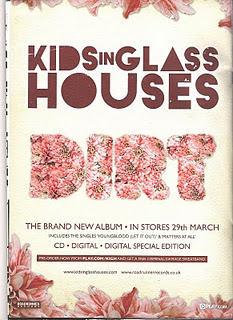 This magazine advert is much different too the one before due to it having a lot more on it. First off all you can see the main elements such as the bands name, and the title of their album. This shares the same qualities as the AC/DC magazine advert. However, this has a lot more conventional factors on. Things such as when it is available to buy, what elements it is sold on e.g digital, CD etc and quotes and reviews of the album. Also, it has website quite small near the bottom and in the far left corner it has the record company this band is signed to. Looking at this magazine advert, it is much like something I would want to do, due to it being out there, informative and attractive. I would want too allow my consumers and audience to know what they are buying, where to buy it, what well known critics think of it. An something I always emphasis is the consistency of this style. All over the advert it has a style and layout that is simple and indubitably similar.
No comments:
Post a Comment